前言
Driver.js 是一款轻量的、没有依赖普通的javascript引擎,目的是为了方便引导用户浏览网站的功能。其实是一款web端分步引导用户查看功能的库。可以让用户更快地更方便地知道你的网站有什么样的功能或者新增了什么功能。
看一下大体的效果
特点
- 简单:方便易用,没用任何的第三方
- 支持自定义:有很多强大的api支持你想要的效果
- 任何元素都可高亮:页面上的任何元素都可以高亮显示
- 支持所有的浏览器(包括IE)
- 遵循MIT Licensed开源协议
安装
// yarn 方式
yarn add driver.js// npm 方式
npm install driver.js引入
import Driver from 'driver.js';
import 'driver.js/dist/driver.min.css';
单个元素高亮
const driver = new Driver();
driver.highlight('#create-post');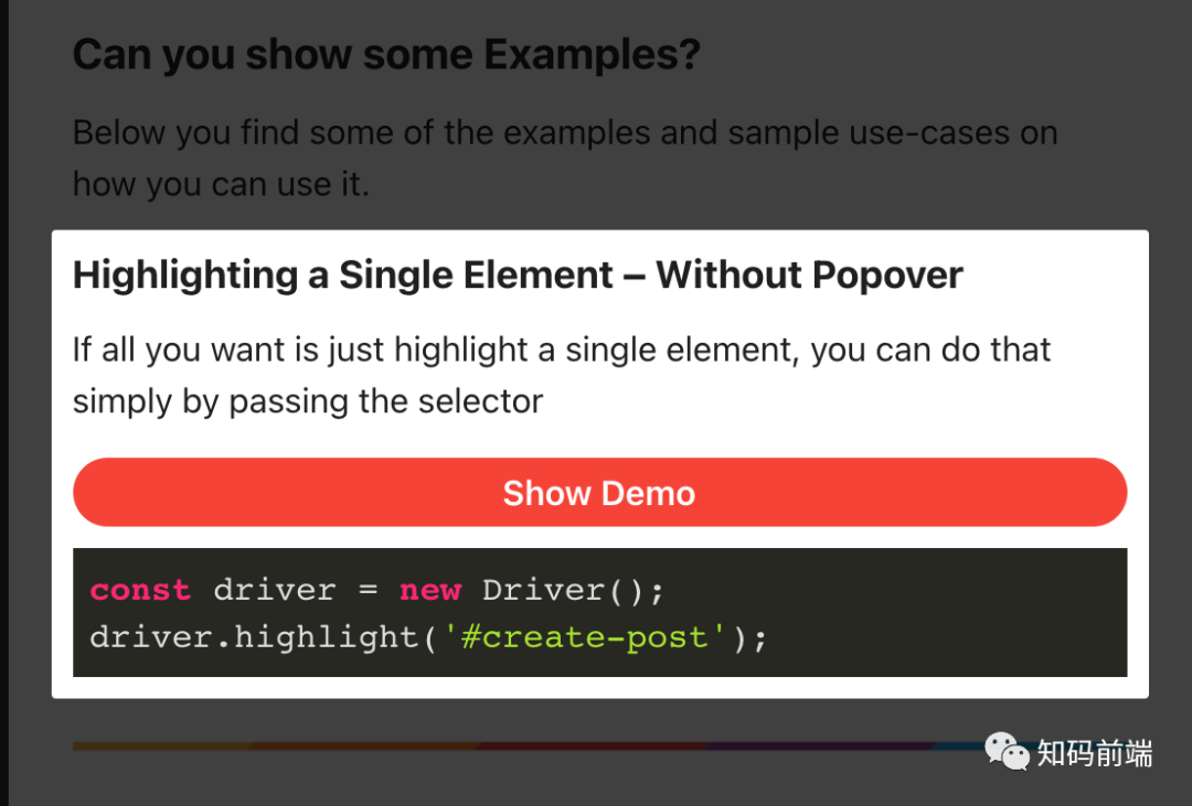
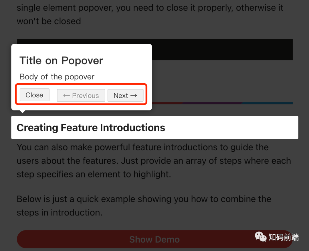
高亮并且弹出提示
const driver = new Driver();
driver.highlight({
  element: '#some-element',
  popover: {
    title: 'Title for the Popover',
    description: 'Description for it',
  }
});
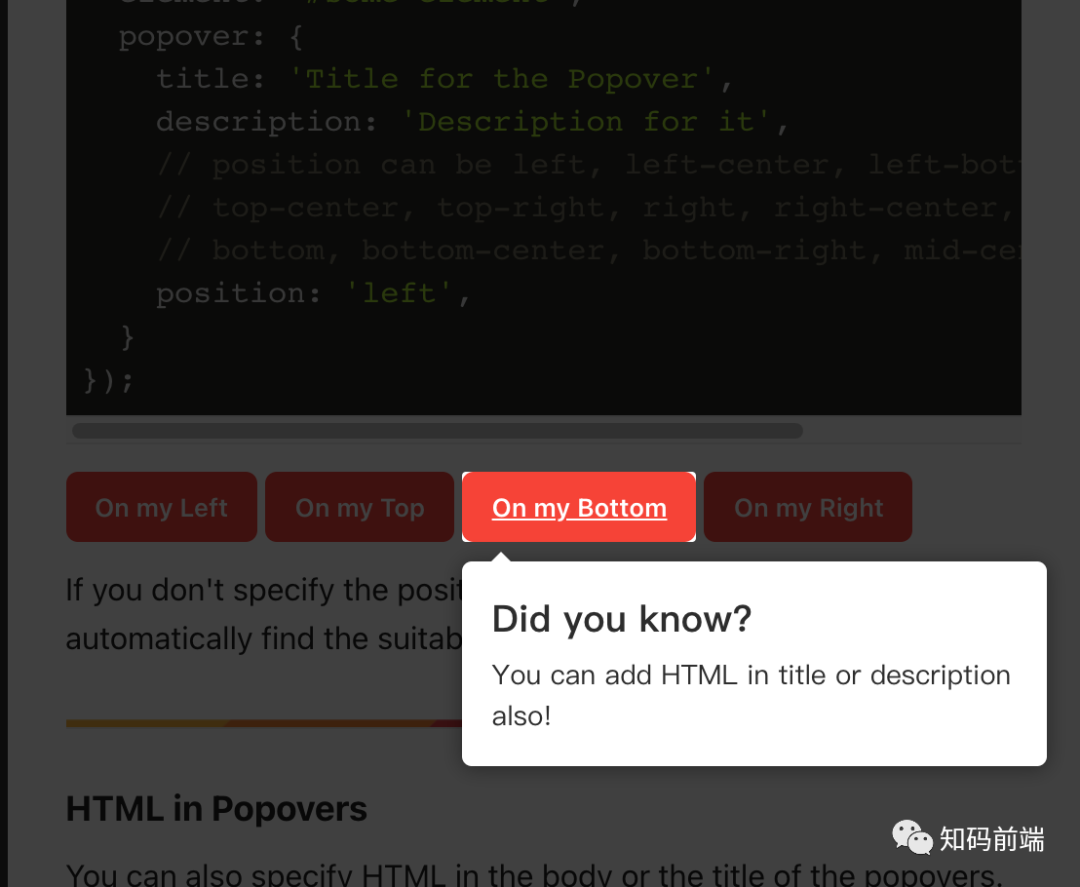
定位弹出框的位置
const driver = new Driver();
driver.highlight({
  element: '#some-element',
  popover: {
    title: 'Title for the Popover',
    description: 'Description for it',
    // position can be left, left-center, left-bottom, top,
    // top-center, top-right, right, right-center, right-bottom,
    // bottom, bottom-center, bottom-right, mid-center
    position: 'left',
  }
});
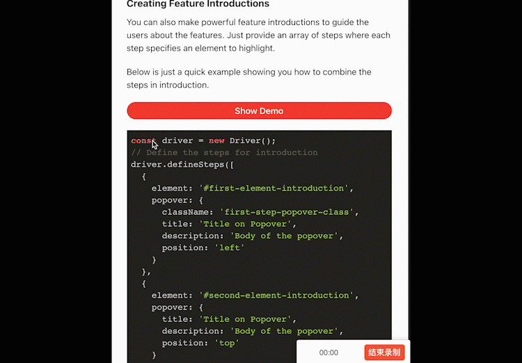
按步提示
const driver = new Driver();// Define the steps for introduction
driver.defineSteps([
{
element: '#first-element-introduction',
popover: {
className: 'first-step-popover-class',
title: 'Title on Popover',
description: 'Body of the popover',
position: 'left'
}
},
{
element: '#second-element-introduction',
popover: {
title: 'Title on Popover',
description: 'Body of the popover',
position: 'top'
}
},
{
element: '#third-element-introduction',
popover: {
title: 'Title on Popover',
description: 'Body of the popover',
position: 'right'
}
},
]);
// Start the introduction
driver.start();
等等好多功能……
api配置
基本配置
const driver = new Driver({
  className: 'scoped-class',        // className to wrap driver.js popover
  animate: true,                    // Whether to animate or not
  opacity: 0.75,                    // Background opacity (0 means only popovers and without overlay)
  padding: 10,                      // Distance of element from around the edges
  allowClose: true,                 // Whether the click on overlay should close or not
  overlayClickNext: false,          // Whether the click on overlay should move next
  doneBtnText: 'Done',              // Text on the final button
  closeBtnText: 'Close',            // Text on the close button for this step
  stageBackground: '#ffffff',       // Background color for the staged behind highlighted element
  nextBtnText: 'Next',              // Next button text for this step
  prevBtnText: 'Previous',          // Previous button text for this step
  showButtons: false,               // Do not show control buttons in footer
  keyboardControl: true,            // Allow controlling through keyboard (escape to close, arrow keys to move)
  scrollIntoViewOptions: {},        // We use `scrollIntoView()` when possible, pass here the options for it if you want any
  onHighlightStarted: (Element) => {}, // Called when element is about to be highlighted
  onHighlighted: (Element) => {},      // Called when element is fully highlighted
  onDeselected: (Element) => {},       // Called when element has been deselected
  onReset: (Element) => {},            // Called when overlay is about to be cleared
  onNext: (Element) => {},                    // Called when moving to next step on any step
  onPrevious: (Element) => {},                // Called when moving to previous step on any step
});
分步配置
const stepDefinition = {
  element: '#some-item',        // Query selector string or Node to be highlighted
  stageBackground: '#ffffff',   // This will override the one set in driver
  popover: {                    // There will be no popover if empty or not given
    className: 'popover-class', // className to wrap this specific step popover in addition to the general className in Driver options
    title: 'Title',             // Title on the popover
    description: 'Description', // Body of the popover
    showButtons: false,         // Do not show control buttons in footer
    doneBtnText: 'Done',        // Text on the last button
    closeBtnText: 'Close',      // Text on the close button
    nextBtnText: 'Next',        // Next button text
    prevBtnText: 'Previous',    // Previous button text
  },
  onNext: () => {},             // Called when moving to next step from current step
  onPrevious: () => {},         // Called when moving to previous step from current step
};
const driver = new Driver(driverOptions);

driver.highlight(stepDefinition);
总结
Driver.js 是一个非常好用的引导用户使用网站功能的js库,可以更加人性化、更加方便快捷地融入到你开发的网站。