
H5+CSS3+JS逆向前置——5、DIV+CSS百分比布局
HTML概述
HTML,全称超文本标记语言(Hypertext Markup Language),是一种用于创建网页的标准标记语言。HTML为网页提供了一种结构性的标记方式,使得浏览器可以正确地解析和显示网页内容。
HTML的主要元素包括:
元素:包括段落、标题、链接、图像、列表等等。HTML为这些元素提供了特定的标签,如<p>、<a>、<img>、<ul>、<li>等。 属性:这些是HTML元素中可以包含的额外信息,如链接的href属性,图像的src和alt属性等。 样式CSS:HTML5引入了内联样式(通过HTML元素直接包含的样式)和外部样式表(通过CSS文件定义的样式)两种方式来控制网页的外观和格式。 脚本JavaScript:HTML5支持通过JavaScript嵌入到网页中,使得网页可以具有交互性。 HTML文档的基本结构通常包括一个<!DOCTYPE html>声明,一个<html>元素,以及若干个<head>和<body>元素。其中,<body>元素包含了网页的所有内容,如文本、图片、视频、音频、链接等等。
HTML是一种基础且重要的技术,它为创建网页提供了基础结构和框架,使得我们可以添加样式、脚本和内容。然而,仅仅使用HTML可能无法创建出具有复杂交互性和动态内容的网站,因此通常还需要配合CSS(用于样式设计)和JavaScript(用于添加交互性)的使用。
开发工具:Visual Studio Code 运行插件:Preview on Web Server
正文——百分比布局
css代码需要单独写一个base.css用来给予div的比例。
* {
  margin: 0px;
  padding: 0px;
  box-sizing: border-box;
}
ul {
  list-style: none;
}
.col-1 {
  width: 8.33%;
  float: left;
}
.col-2 {
  width: 16.67%;
  float: left;
}
.col-3 {
  width: 25%;
  float: left;
}
.col-4 {
  width: 33.33%;
  float: left;
}
.col-5 {
  width: 41.67%;
  float: left;
}
.col-6 {
  width: 50%;
  float: left;
}
.col-7 {
  width: 58.33%;
  float: left;
}
.col-8 {
  width: 66.67%;
  float: left;
}
.col-9 {
  width: 75%;
  float: left;
}
.col-10 {
  width: 83.33%;
  float: left;
}
.col-11 {
  width: 91.67%;
  float: left;
}
.col-12 {
  width: 100%;
  float: left;
}
布局需求
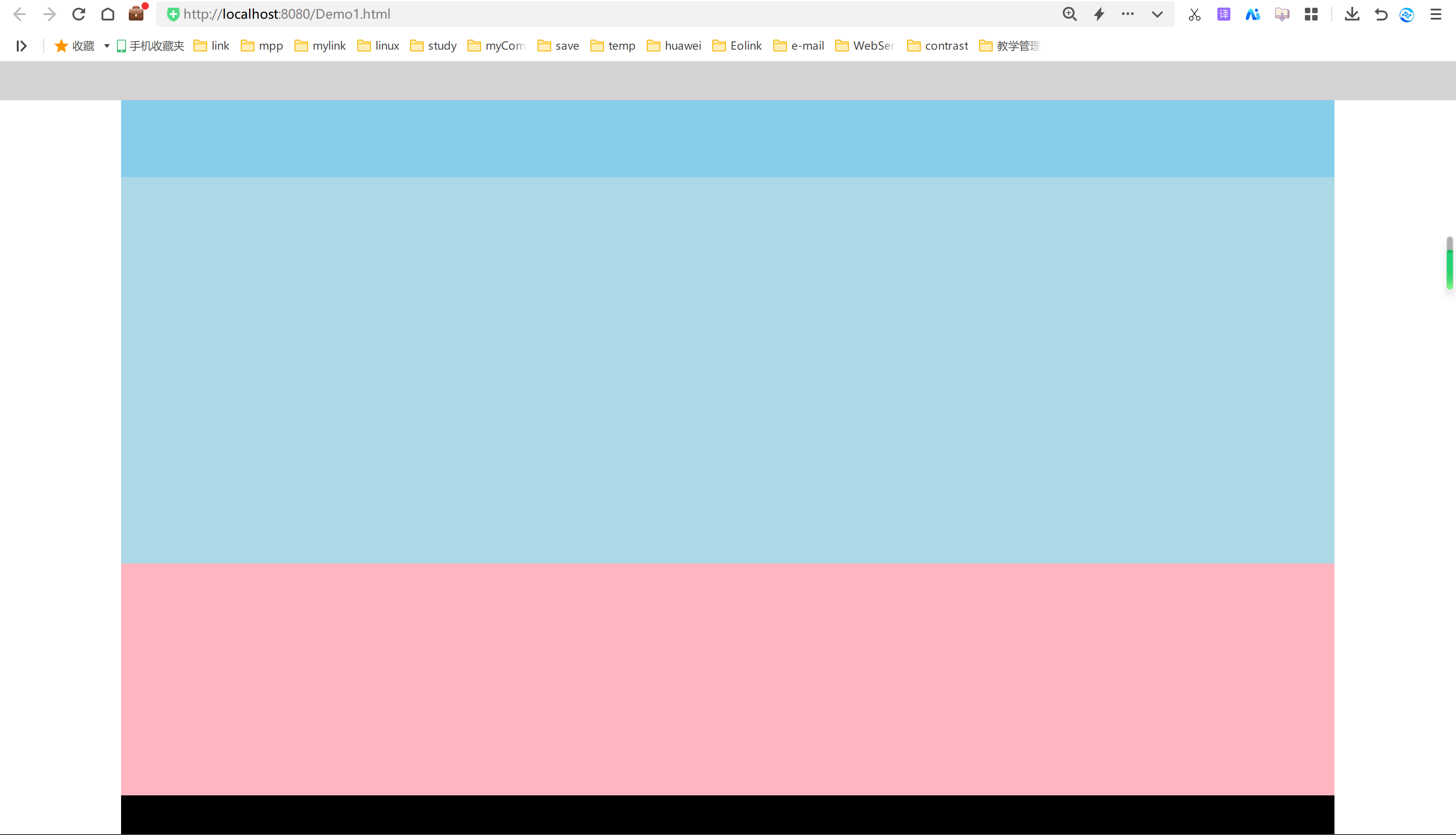
top:头部菜单,gray灰色,宽度100%列宽,高度(5vh) banner_text:横幅文字,skyblue天蓝色,左右1/12留白,正文10/12列宽,高度(10vh) banner_img:横幅图片,浅蓝色lightblue,左右1/12留白,正文10/12列宽,高度(50vh) list_info:信息列表,浅粉色lightpink,左右1/12留白,正文10/12列宽,高度(30vh) footer:网站备案信息,黑色black,左右1/12留白,正文10/12列宽,高度(5vh)
布局源码
<!DOCTYPE html>
<html lang="en">
  <head>
    <meta charset="UTF-8" />
    <meta name="viewport" content="width=device-width, initial-scale=1.0" />
    <title>百分比布局</title>
    <link rel="stylesheet" href="css/base.css" />
  </head>
  <body>
    <!--top-->
    <div class="col-12" style="background-color: lightgray; height: 5vh"></div>
    <!-- banner_text -->
    <div class="col-12" style="height: 10vh">
      <div class="col-1" style="background-color: #fff; height: 10vh"></div>
      <div class="col-10" style="background-color: skyblue; height: 10vh"></div>
      <div class="col-1" style="background-color: #fff; height: 10vh"></div>
    </div>
    <!-- banner_img -->
    <div class="col-12" style="height: 50vh">
      <div class="col-1" style="background-color: #fff; height: 50vh"></div>
      <div
        class="col-10"
        style="background-color: lightblue; height: 50vh"
      ></div>
      <div class="col-1" style="background-color: #fff; height: 50vh"></div>
    </div>
    <!-- list_info -->
    <div class="col-12" style="height: 30vh">
      <div class="col-1" style="background-color: #fff; height: 30vh"></div>
      <div
        class="col-10"
        style="background-color: lightpink; height: 30vh"
      ></div>
      <div class="col-1" style="background-color: #fff; height: 30vh"></div>
    </div>
    <!-- footer -->
    <div class="col-12" style="height: 5vh">
      <div class="col-1" style="background-color: #fff; height: 5vh"></div>
      <div class="col-10" style="background-color: #000; height: 5vh"></div>
      <div class="col-1" style="background-color: #fff; height: 5vh"></div>
    </div>
  </body>
</html>
实际布局效果
整个布局内容为body内容的100%,根据提议需求所创建。
添加基础文字
<!DOCTYPE html> <html lang="en">
<head>
<meta charset="UTF-8">
<meta http-equiv="X-UA-Compatible" content="IE=edge">
<meta name="viewport" content="width=device-width, initial-scale=1.0">
<title>百分比布局</title>
<link rel="stylesheet" href="css/base.css">
<body>
<!--top-->
<div class="col-12" style="background-color: lightgray;height: 5vh;">
<style>
.top_ul{
width: 100%;
text-align: center;
}
.top_ul li{
width: 20%;
float: left;
line-height: 5vh;
cursor: pointer;
}
.top_ul li:hover{
background-color: #000;
color: #fff;
}
</style>
<ul class="top_ul">
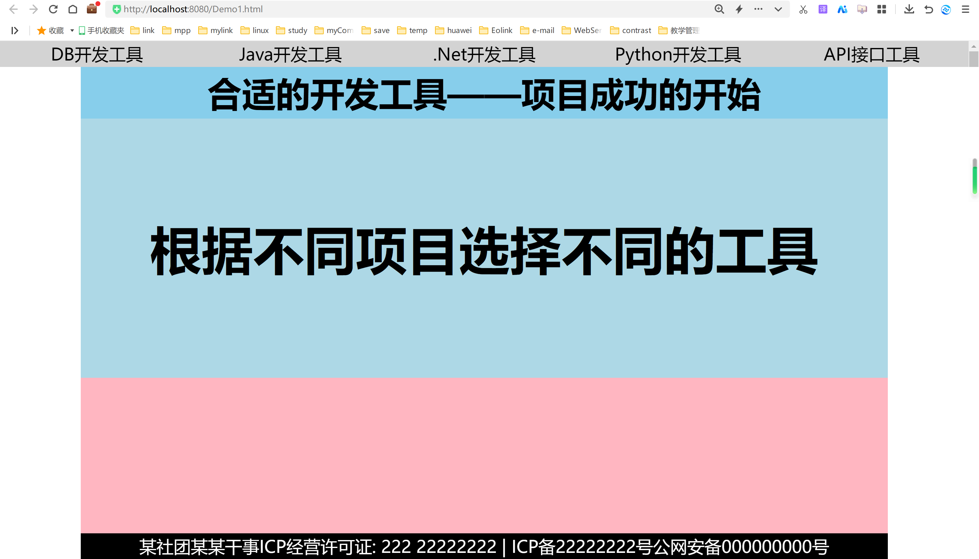
<li>DB开发工具</li>
<li>Java开发工具</li>
<li>.Net开发工具</li>
<li>Python开发工具</li>
<li>API接口工具</li>
</ul>
</div>
<!-- banner_text -->
<div class="col-12" style="height: 10vh;">
<div class="col-1" style="background-color: #fff;height: 10vh;"></div>
<style>
.banner_text{
text-align: center;
line-height: 10vh;
font-size: 2rem;
font-weight: bolder;
}
</style>
<div class="col-10 banner_text" style="background-color: skyblue;height: 10vh;">
合适的开发工具——项目成功的开始
</div>
<div class="col-1" style="background-color: #fff;height: 10vh;"></div>
</div>
<!-- banner_img -->
<div class="col-12" style="height: 50vh;">
<div class="col-1" style="background-color: #fff;height: 50vh;"></div>
<style>
.banner_img{
text-align: center;
line-height: 50vh;
font-size: 3rem;
font-weight: bolder;
background-image: url("imgs/bg.png");
background-size: 100% 100%;
}
</style>
<div class="col-10 banner_img" style="background-color: lightblue;height: 50vh;">
根据不同项目选择不同的工具
</div>
<div class="col-1" style="background-color: #fff;height: 50vh;"></div>
</div>
<!-- list_info -->
<div class="col-12" style="height: 30vh;">
<div class="col-1" style="background-color: #fff;height: 30vh;"></div>
<div class="col-10" style="background-color: lightpink;height: 30vh;"></div>
<div class="col-1" style="background-color: #fff;height: 30vh;"></div>
</div>
<!-- footer -->
<div class="col-12" style="height: 5vh;">
<div class="col-1" style="background-color: #fff;height: 5vh;"></div>
<style>
.footer_text{
text-align: center;
color: white;
line-height: 5vh;
}
</style>
<div class="col-10 footer_text" style="background-color: #000;height: 5vh;">
某社团某某干事ICP经营许可证: 222 22222222 | ICP备22222222号公网安备000000000号Copyright©0000 2222
</div>
<div class="col-1" style="background-color: #fff;height: 5vh;"></div>
</div>
</body>
</html>
基础文字效果
百分比布局总结
百分比布局相当于flax布局,css flex布局,我个人不太喜欢flex布局,因为它的属性并不是很好用,还是自己写的最靠谱,但是如果是bootstrap布局还是可以使用的,用着也挺方便,我们看看flex涉及到的属性:
- flex-direction: 这个属性定义了 flex 容器中项目在主轴上的方向。它可以是从左到右(row)或从右到左(column)。
- flex-wrap: 这个属性定义了 flex 项目的换行方式。如果 flex-wrap 设置为 nowrap,项目将在一行内排列,直到空间耗尽时才会换行。如果 flex-wrap 设置为 wrap 或 wrap-reverse,项目将在新的一行开始,如果需要的话。
- flex-flow: 这个属性是 flex-direction 和 flex-wrap 的简写形式,用于同时设置主轴方向和换行方式。
- justify-content: 这个属性定义了 flex 容器中主轴上的项目对齐方式。它可以对齐单个项目或者对齐一行项目。
- align-items: 这个属性定义了 flex 项目在交叉轴上的对齐方式。align-items 会考虑项目的长度和容器的空间。
- align-content: 这个属性用于在一行多项目的情况下,定义项目在交叉轴上的对齐方式。它通常与 flex-flow 或 align-items 一起使用。这些属性都是 CSS Flexbox 布局模型的一部分,用于控制项目在容器中的排列方式。
有喜欢的可以自行获取,但个人建议使用bootstrap的更方便。