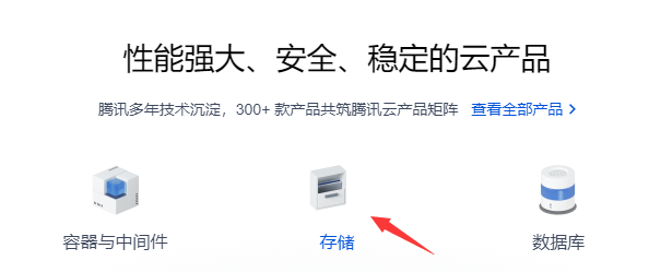
最近腾讯云官网改版,更新了一些动态图标
腾讯云首页帧动画实现
其实实现方法很简单,就是CSS3的animate属性就可以实现。 之前做过一个微博点赞的例子,以下是源码 把动画所需要的帧图片放到一张图上,然后通过animate属性来控制它。 横向或者纵向都可以,鼠标经过会进行3d旋转
代码语言:javascript
复制
<!DOCTYPE html> <html lang="en"><head>
<meta charset="UTF-8">
<meta name="viewport" content="width=device-width, initial-scale=1.0">
<meta http-equiv="X-UA-Compatible" content="ie=edge">
<title>animate</title>
<script type="text/javascript" src="http://apps.bdimg.com/libs/jquery/2.1.4/jquery.min.js"></script>
<style>
*,
:after,
:before {
box-sizing: border-box;
}.ani { width: 23px; position: relative; height: 28px; } .btn { display: inline-block; cursor: pointer; } .like { display: inline-block; border-radius: 50px; } .btn .ani::before { content: ''; position: absolute; left: 0px; top: 0px; width: 23px; height: 28px; background-image: url('./images/steps_praised.png'); background-position: left; background-repeat: no-repeat; background-size: 483px 28px; } .like .ani::before { animation: likeBlast 0.65s 1 steps(20); background-position: right; } @keyframes likeBlast { 0% { background-position: left; } 100% { background-position: right; } } .icon { width: 60px; height: 60px; background: url('./images/ani-storage.png'); background-position: top; background-repeat: no-repeat; background-size: 60px 1500px; cursor: pointer; margin-top: 50px; } /* .icon:hover { animation: in 0.5s 1 steps(24); background-position: bottom; } */ @keyframes in { 0% { background-position: top; } 100% { background-position: bottom; } } @keyframes out { 0% { background-position: bottom; } 100% { background-position: top; } } .anis { animation: in 0.5s 1 steps(24) forwards; } .moveanis { animation: out 0.5s 1 steps(24) forwards; } </style></head>
<body>
<div class="btn">
<div class="ani"></div>
</div>
<p>鼠标点击</p>
<div class="icon">
</div>
<p>鼠标经过</p>
</body>
<script>$(function () { $('.btn').click(function () { $(this).toggleClass('like') }) $('.icon').hover(function () { $(this).removeClass('moveanis').addClass('anis') }, function () { $(this).removeClass('anis').addClass('moveanis') }) })</script>
</html>
所需图片下载

腾讯云首页帧动画实现

腾讯云首页帧动画实现